
Packaging is the only marketing material your customer physically touches. Every other channel — advertising, social, website — is a screen. The package is in their hands. That makes it unlike anything else in the brand system, and it deserves to be treated that way.
Here’s what’s actually happening in packaging design right now, from where we’re working and what we’re seeing in the market.
Sustainability Has Become Table Stakes, Not a Differentiator
Two or three years ago, sustainable packaging was a competitive advantage. Brands could feature it prominently as a point of difference. That window is closing. Consumers now expect it. The brands who are treating sustainability as a headline are increasingly going to look like they’re trying too hard — because everyone else is doing it too.
What matters now is being specific. Not “eco-friendly packaging” but: what material, what certification, what reduction in weight or waste, compared to what. Vague sustainability claims are becoming indistinguishable from greenwashing, which is a brand risk, not a brand asset.
The design challenge is making the sustainability story visible without making it the whole story. It’s a value the product holds, not the product’s identity.
Further reading: Wikipedia: Packaging · Dieline: Packaging Trends
Minimalism Is Reaching a Crisis Point
The wave of minimal packaging — white space, single typeface, restrained colour palette — has been going for a decade. It was a reaction against the cluttered, loud packaging of the early 2000s. It produced some genuinely beautiful work. It’s also produced an enormous volume of packaging that looks identical.
Walk through a premium food section in any Swiss or European supermarket and count how many packages use the same combination: white background, single serif typeface, small logo, one muted accent colour. The minimal aesthetic, over-applied, has become the new generic.
The brands breaking through are doing so with character — unexpected colour combinations, distinctive illustration, typography that has a point of view. Minimal still works, but only when there’s a genuine reason for it, not because it feels “premium” by default.
What’s on the Back of the Package Matters Again
For years, the back of the package was legal copy and nutritional tables. Consumers weren’t reading it. That’s shifting. People scan QR codes, read origin stories, look for the detail that tells them whether a brand is real or manufactured.
Brands that use the back — and the inside of the box — as a storytelling surface are building something different from brands that treat it as an afterthought. A brand that surprises you when you open the box is a brand people talk about. That’s free marketing that most packaging briefs don’t even consider.
Premium Tactile Finishes Are Reaching Mid-Market
Soft-touch laminate, foil blocking, embossing, spot UV — finishes that used to be reserved for luxury goods are moving into mid-market products as production costs decrease. This is creating a problem: when everyone uses the same premium finish, it’s no longer a premium signal.
The answer isn’t to avoid tactile finishes — it’s to use them with purpose. A texture that’s connected to what the product is (rough finish for a rugged outdoor product, smooth matte for a skincare brand) works. A premium finish applied without reason just adds cost.
What’s Dying Out
Gradient backgrounds used without restraint — this had a moment and it’s ending. Overcrowded design where every surface is filled — consumer attention is limited and cluttered packaging loses to clear packaging in a three-second shelf decision. Badge-heavy packaging — certifications, awards, endorsements stacked across the front — signals insecurity more than quality.
And the trend that deserves to die: packaging designed for social media that doesn’t work as packaging. Beautiful to photograph, frustrating to use, impossible to open cleanly. The unboxing moment is real, but the product has to work after the moment is over.
A Note on Briefing Packaging Design
The best packaging briefs start with the shelf context — where exactly will this sit, next to what, and in what light? — and the user moment: who picks this up, when, and what are they hoping to feel? Those questions determine everything else. Colour, hierarchy, material, finish.
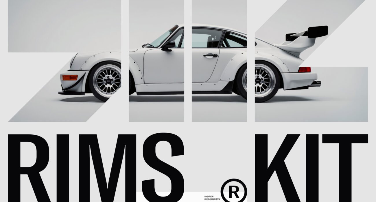
At Denovo, packaging design work has taken us into sectors as different as automotive (RIMS KIT) and food (Zelenukha). The brief is always different. The process — starting with the user moment and working backwards to the visual — is always the same.
If you’re working on a packaging project, talk to us.